
Showing listings of data for user selection is generally shown to the user in Select drop-down HTML control. Which is a traditional and nice way to show a limited set of data for selection.
But what if we have dynamic data lists which can have thousands of rows to show? We can’t simply feed all data to UI DOMS as it may adversely affect page performance.
In such a case, we can use ng-select component which not only let users select single of multiple options but can also load data dynamically to act like a typeahead or autocomplete suggestions.
The ng-select is also preferred as there is no need for any other dependency like Bootstrap or Angular Material.
Let’s get to know how quickly use it!
For making this tutorial simple we will first create a new Angular project in latest version 8.
Create A New Angular Project
Using Ng CLI tool we will create a new Angular project by running below command in terminal:
| 12 | $ ng new ng-select-demo |
Install & Configure Ng-Select
After creating an Angular project next we will install ng-select page.
Step 1) Run the following command in terminal to install ng-select:
| $ npm install –save @ng-select/ng-select |
Step 2) To use ng-select component, we need to import NgSelectModule & FormsModule in app.module.ts file:
// app.module.ts
import { BrowserModule } from ‘@angular/platform-browser’;
import { NgModule } from ‘@angular/core’;
import { AppRoutingModule } from ‘./app-routing.module’;
import { AppComponent } from ‘./app.component’;
import { NgSelectModule } from ‘@ng-select/ng-select’;
import { FormsModule } from ‘@angular/forms’;
@NgModule({
declarations: [
AppComponent
],
imports: [
BrowserModule,
AppRoutingModule,
NgSelectModule,
FormsModule
],
providers: [],
bootstrap: [AppComponent]
})
export class AppModule { }
Step 3) Finally, add a theme to style our awesome ng-select component.
We already have three themes available to select from. Import any of the following in the style.css file:
@import "~@ng-select/ng-select/themes/default.theme.css";
@import "~@ng-select/ng-select/themes/material.theme.css";

@import “~@ng-select/ng-select/themes/ant.design.theme.css”;
Now we are done with ng-select installation and configurations required to use anywhere in our application:
Use Ng-Select Component
To create a select component add the ng-select component as shown below:
<ng-select [items]="items"
           bindLabel="name"
           placeholder="Select item"
           appendTo="body"
           multiple="true"
           [(ngModel)]="selected">
</ng-select>
with component class content:
// app.component.ts
import { Component } from ‘@angular/core’;
@Component({
selector: ‘app-root’,
templateUrl: ‘./app.component.html’,
styleUrls: [‘./app.component.css’]
})
export class AppComponent {
items = [
{id: 1, name: ‘Python’},
{id: 2, name: ‘Node Js’},
{id: 3, name: ‘Java’},
{id: 4, name: ‘PHP’, disabled: true},
{id: 5, name: ‘Django’},
{id: 6, name: ‘Angular’},
{id: 7, name: ‘Vue’},
{id: 8, name: ‘ReactJs’},
];
selected = [
{id: 2, name: ‘Node Js’},
{id: 8, name: ‘ReactJs’}
];
}
There are some required and optional properties:
items: Array or object of local or remote content to populate as select options.
bindLabel: The property of object which we want to show as a label in select box.
placeholder: Text shown to the user when nothing is selected.
appendTo: By default, the options wrapper is appended to the ng-select element but it can be added to other elements using this property.
multiple: Single or multiple options can be selected by setting true or false
searchable: Boolean; Enable or disable filter feature.
clearable: Boolean; Add or remove cross icon to clear selected value.
maxSelectedItems: When multiple is set to true we can limit maximum items available to select.
disabled: Enable or disable the select component.
Using Ng-Select With Ng-Options
We can also use ng-option element in ng-select to customize the view of options as shown below:
   <ng-select bindLabel="name"
                placeholder="Select item"
                appendTo="body"
                multiple="true"
                [searchable]="true"
                [clearable]="true"
                [(ngModel)]="selected">
                <ng-option [value]="item.id" [disabled]="item.disabled" *ngFor="let item of items">
                    <img src="./assets/{{item.image}}" width="20px" height="20px"/>
                    {{item.name}}
                </ng-option>
    </ng-select>
In component, we will have selected variable as an array of id’s
export class AppComponent {
items = [
{id: 1, name: ‘Python’, image: ‘python.jpg’},
{id: 2, name: ‘Node Js’, image: ‘nodejs.jpg’},
{id: 3, name: ‘Java’, image: ‘java.jpg’},
{id: 4, name: ‘PHP’, image: ‘php.jpg’, disabled: true},
{id: 5, name: ‘Django’, image: ‘django.jpg’},
{id: 6, name: ‘Angular’, image: ‘angular.jpg’},
{id: 7, name: ‘Vue’, image: ‘vue.jpg’},
{id: 8, name: ‘ReactJs’, image: ‘reactjs.jpg’},
];
selected = [ 2, 8 ];
}
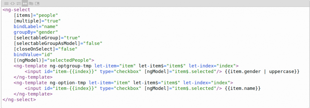
Show Checkboxes With Select Options
Checkboxes can be shown with each item and also as group checkboxes by using selectableGroup & selectableGroupAsModel properties.
Get Values On Change
To get values on selection change use (change) event binder
Template-Driven Validation On NgSelect
For simple form validation, just put ng-select in a form with template variable #myForm and (submit) method.
On ng-select add name and required property as shown below:
So here we discussed the basic implementation on the ng-select module to quickly integrate into an Angular project. Check out more examples and options here.


 is not a function @ionic-native/file")


